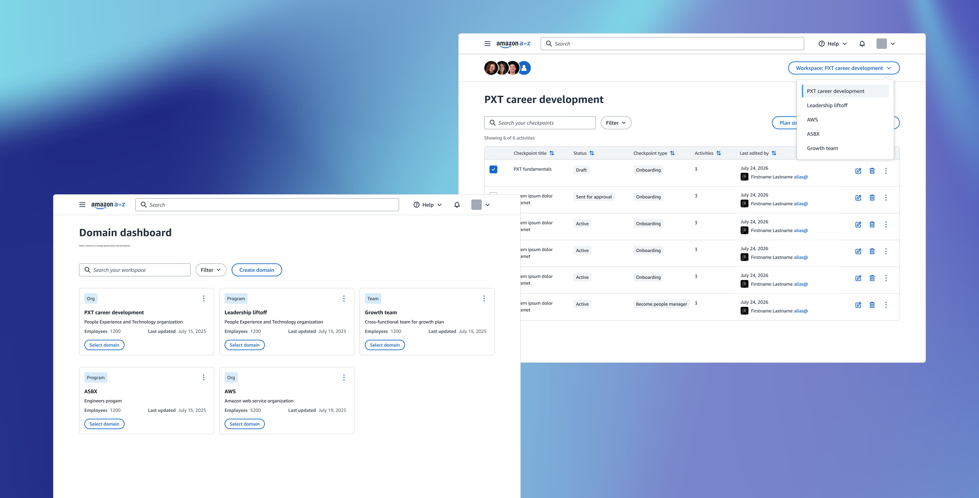
Redesigning Amazon Onboarding Experience
Building one framework that could grow from a small pilot to a global workforce
I created one onboarding plan framework and tested it first in Lift Off, a program with 12K+ users. The longer-term goal was to make it the standard growth plan for corporate blue badge employees across Amazon.
My role
Lead UX Designer
Timeline
Oct 2025 - Dec 2025
Team
1 designer 1 PM 10 developers
Tools
Figma UserTesting Kiro (Claude model)
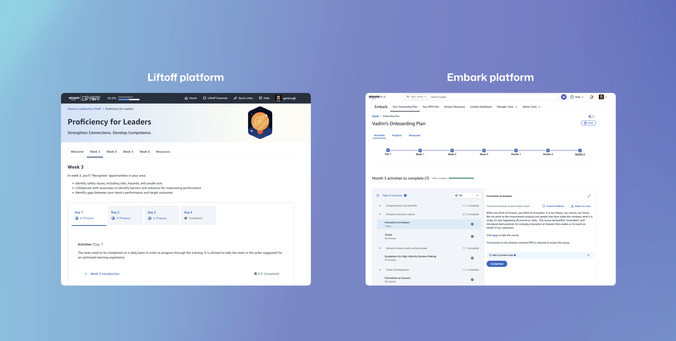
Too many onboarding tools
Amazon teams used different onboarding tools for different employee groups. That meant the experience changed depending on where someone worked, while teams had to maintain similar content and features across several separate platforms.
01
An inconsistent employee experience
Embark, Lift Off, and ASBX each organized onboarding differently. Two employees joining Amazon could get completely different guidance, navigation, and content simply because they joined different orgs.
02
Harder to maintain and scale
Every update had to be designed, built, and maintained across separate systems. Teams repeated the same work, and improvements in one tool did not automatically reach employees using the others.
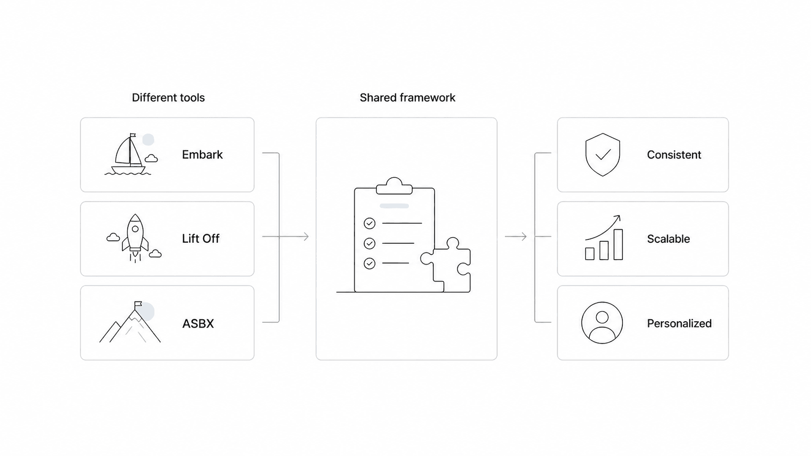
One scalable framework for every onboarding experience
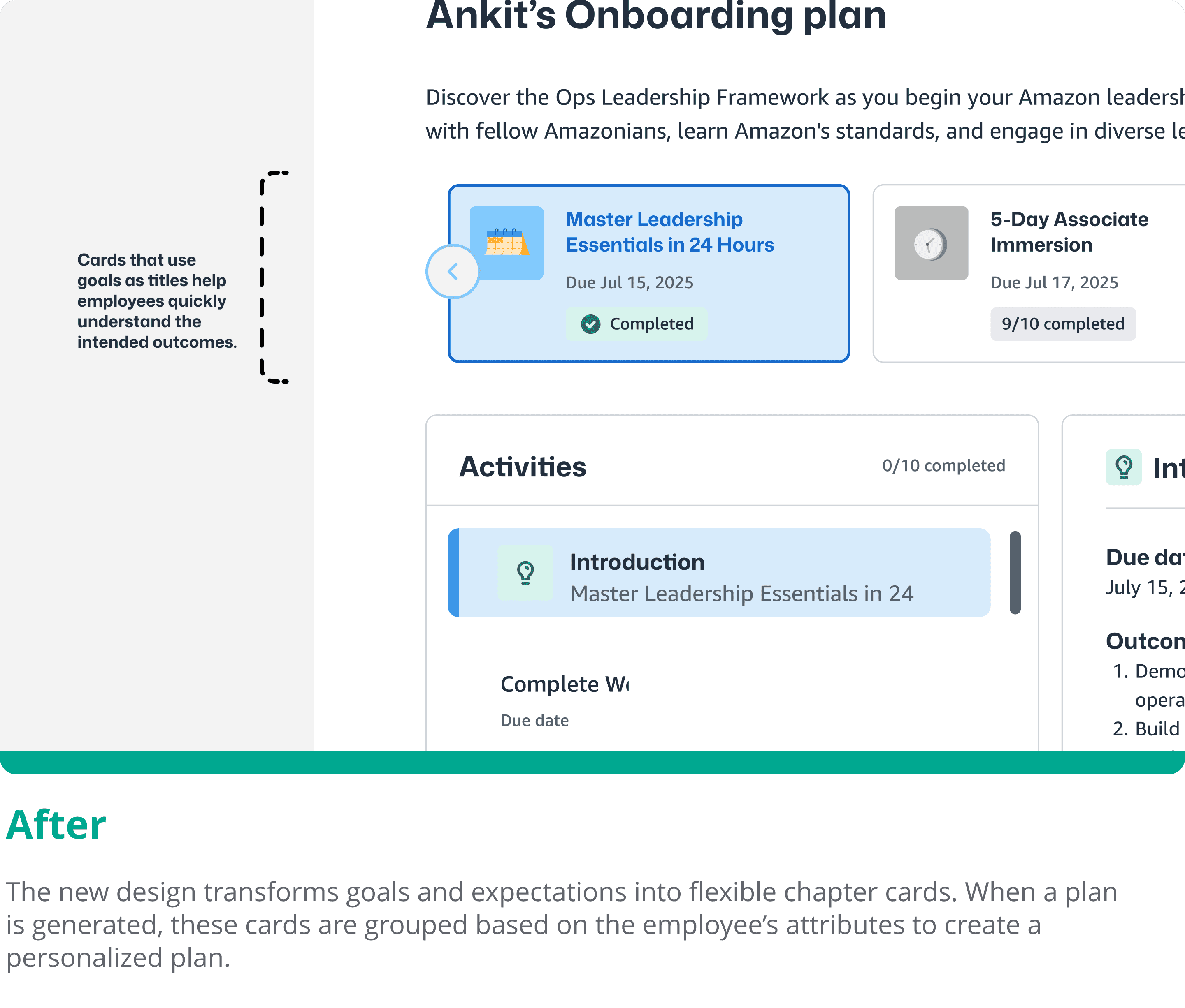
Instead of redesigning every tool separately, we created one shared framework that could work inside Embark, Lift Off, or ASBX. Teams could reuse the same structure while still tailoring the plan to each employee.
Starting with a smaller pilot
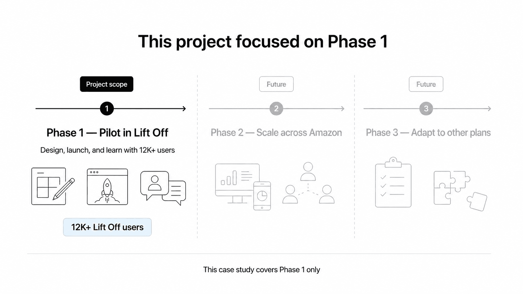
This project focused on Phase 1 only. We used Lift Off, which had 12K+ users, to design the shared framework, launch a focused pilot, and learn from real employees. Any expansion beyond Lift Off was outside the scope of this project.
01
Design the framework
Create one reusable structure for goals, chapters, and personalized onboarding content.
02
Pilot in Lift Off
Launch the new framework with the Lift Off population instead of trying to change every onboarding tool at once.
03
Learn from real users
Use feedback and behavior from the pilot to understand what worked and what needed to change.
How could we bring these separate platforms into one framework and give every employee a more personal, goal-based journey?
What past research told us
Before redesigning the product, I reviewed earlier employee and manager research to understand what was not working at the plan level. Three findings came up again and again.
Insight 01
80% of employees were unclear about expectations and goals
Without clear learning outcomes, employees did not always know what they were expected to learn or why an activity mattered. They wanted to see the expected outcome before starting an activity.
Insight 02
Different teams had different onboarding activities
Even within the same organization, teams and managers expected different things from new hires. Those differences were not clearly reflected or communicated in the onboarding plan.
Insight 03
Current plans were not personalized for every role
A designer and a software engineer could receive the same general plan even though their work and learning needs were different. Employees needed content that reflected their role, level, and team.
Auditing the current onboarding UI
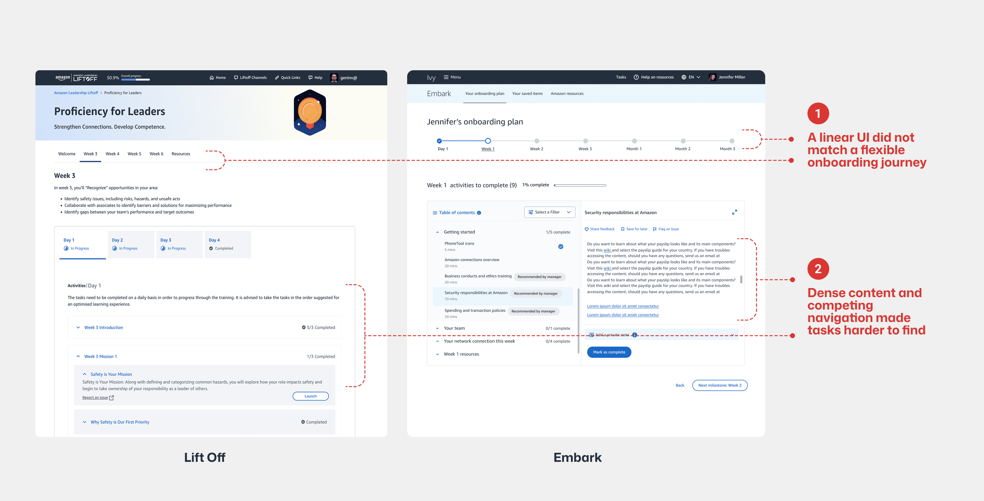
I then reviewed the Lift Off and Embark interfaces to see how those broader research findings showed up in the UI. I focused on navigation, content hierarchy, and how employees moved between onboarding activities.
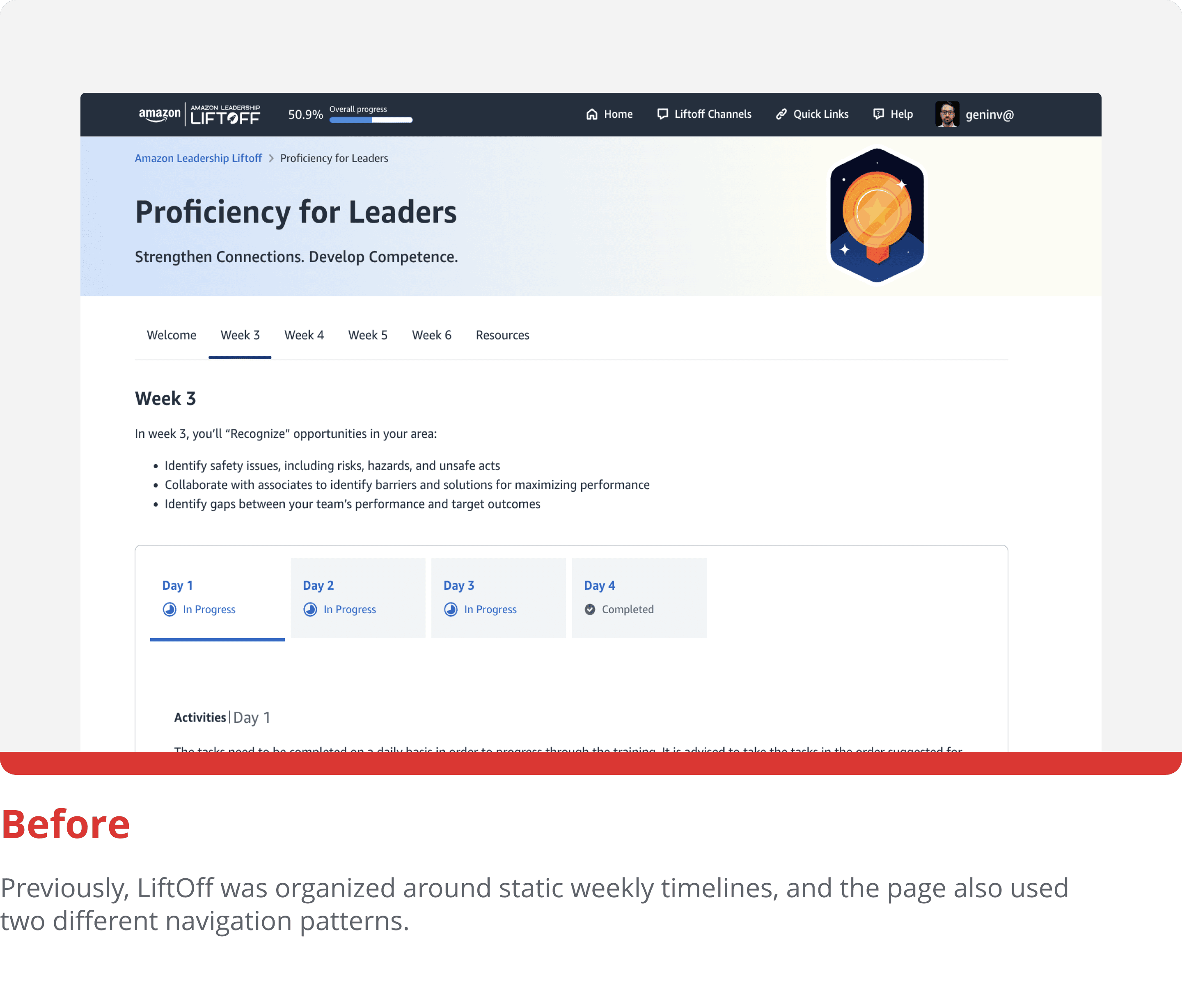
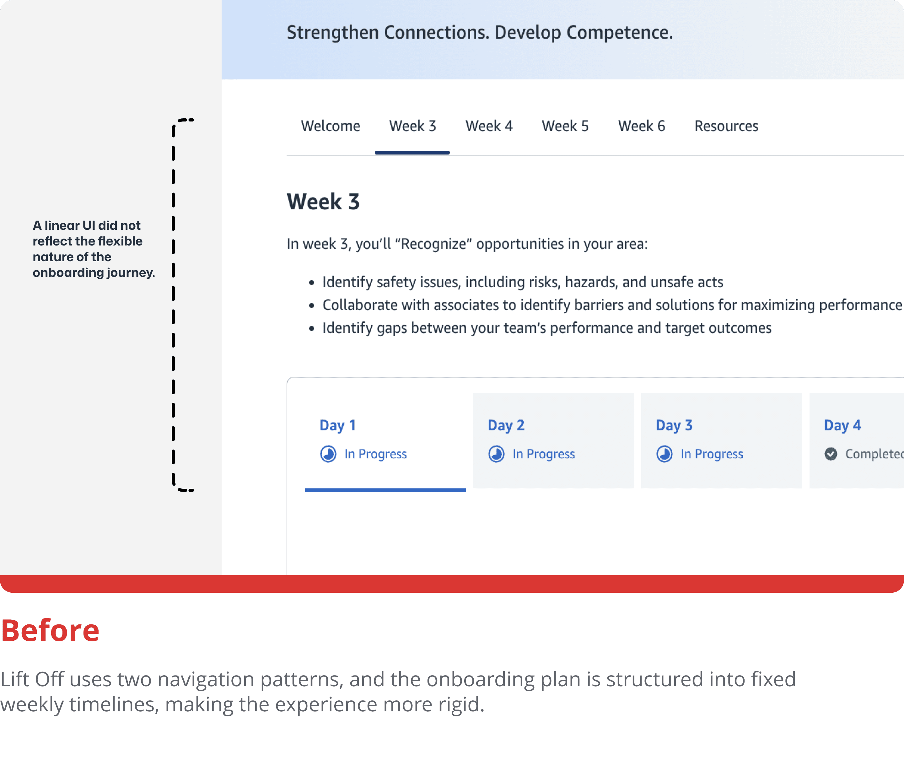
A linear UI did not match a flexible onboarding journey
The metro-stop navigation suggested a fixed Week 1, Week 2, Week 3 sequence. In reality, employees moved between meetings, projects, people, and learning activities in a much less predictable order.
Information overload
Employees faced long pages of text and large task lists. Lift Off also used two navigation systems, making it harder to know where they were, find the right activity, and return to work they had already started.
Brainstorm
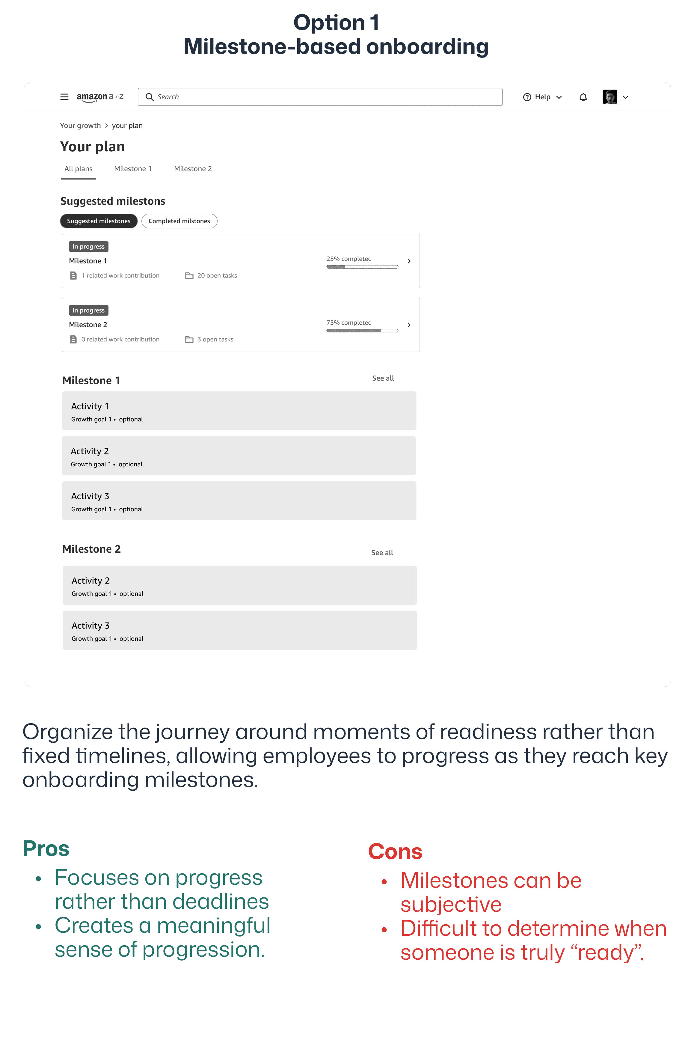
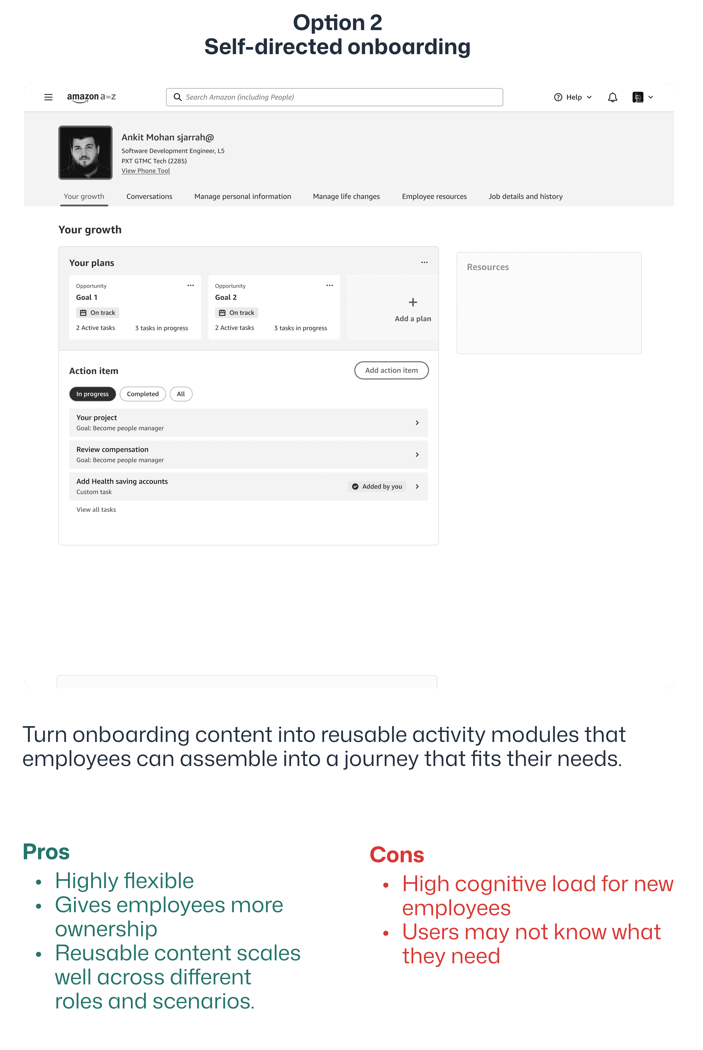
I mapped each research insight to possible changes in the plan structure and the interface. Early sketches helped me explore how personalization, modular chapters, and simpler navigation could work together before I committed to a layout.
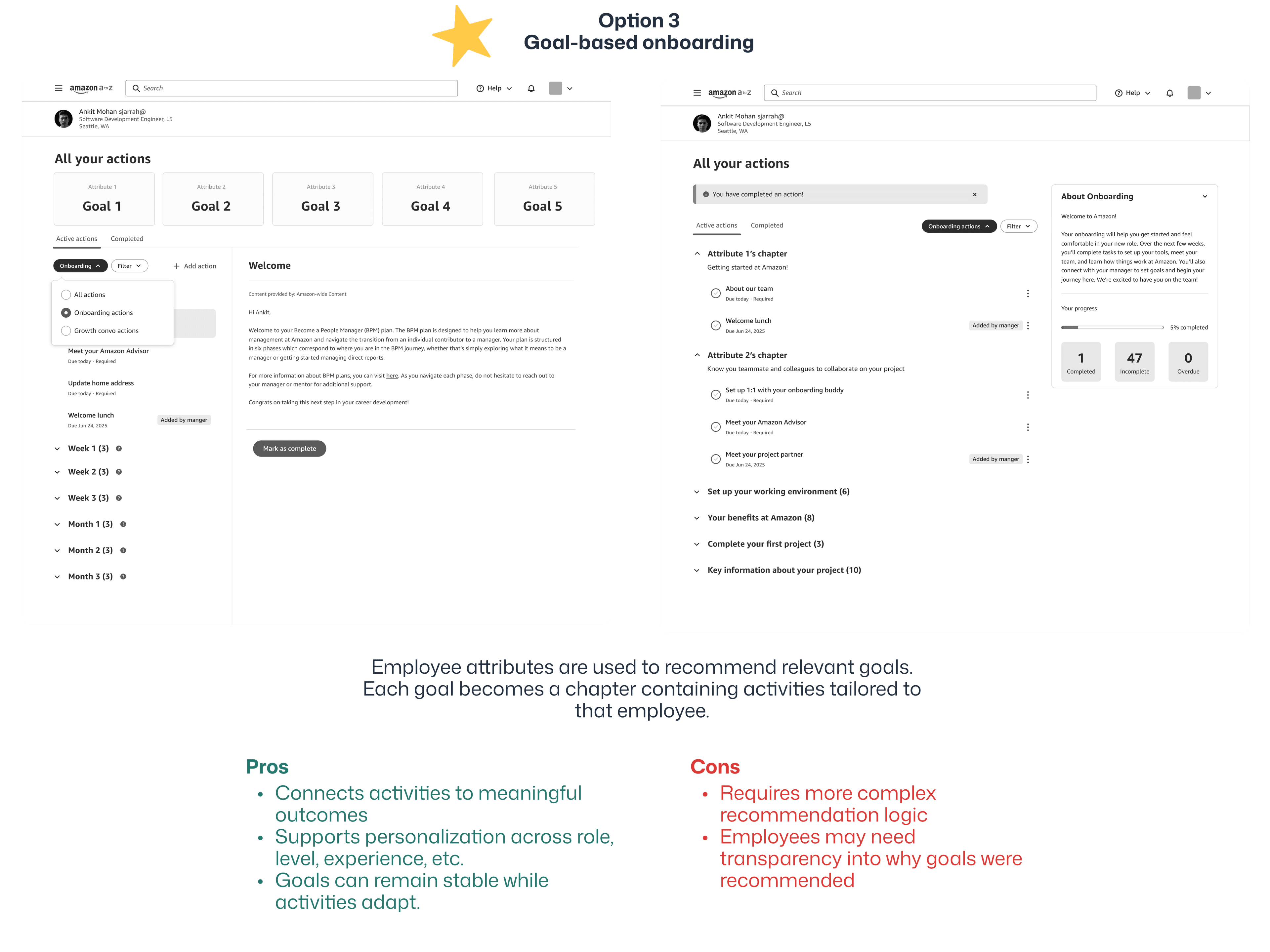
Why goal-based onboarding?
It created the strongest balance between guidance and personalization. Goals give employees a clear understanding of what they are working toward, while flexible activities allow the experience to adapt to differences in role, experience, and context.
Goals tailored to the employee
An employee's role, team, and experience level would determine which goals appeared in their onboarding plan.
Chapters organize the content
Each goal would be broken into smaller learning chapters, making the plan easier to scan, navigate, and complete.
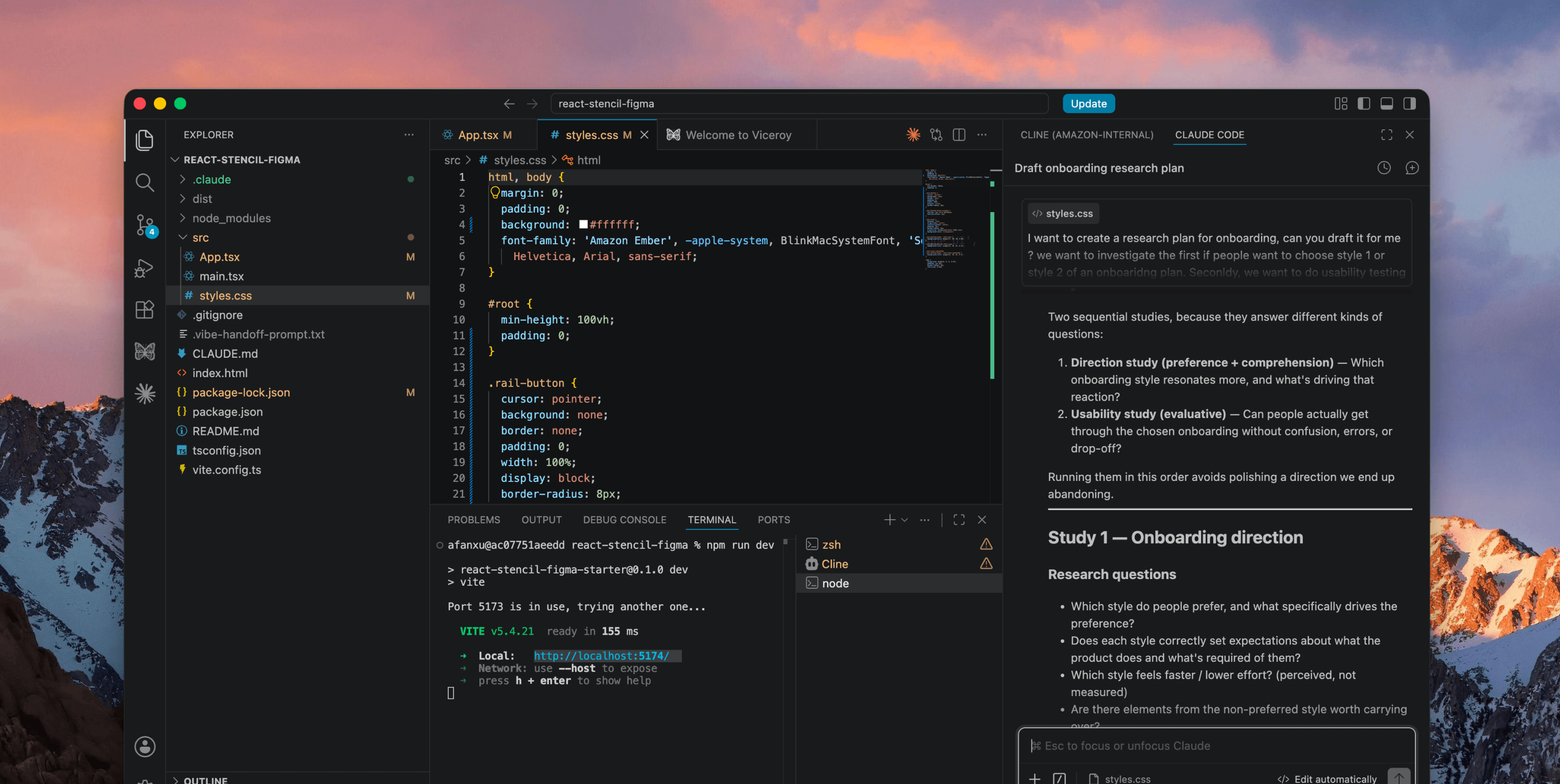
Planning the research with AI
With the goal-and-chapter framework decided, I still needed to understand how employees should move through it. I designed two UI layouts using the same content and structure, then planned an A/B usability test to compare them.
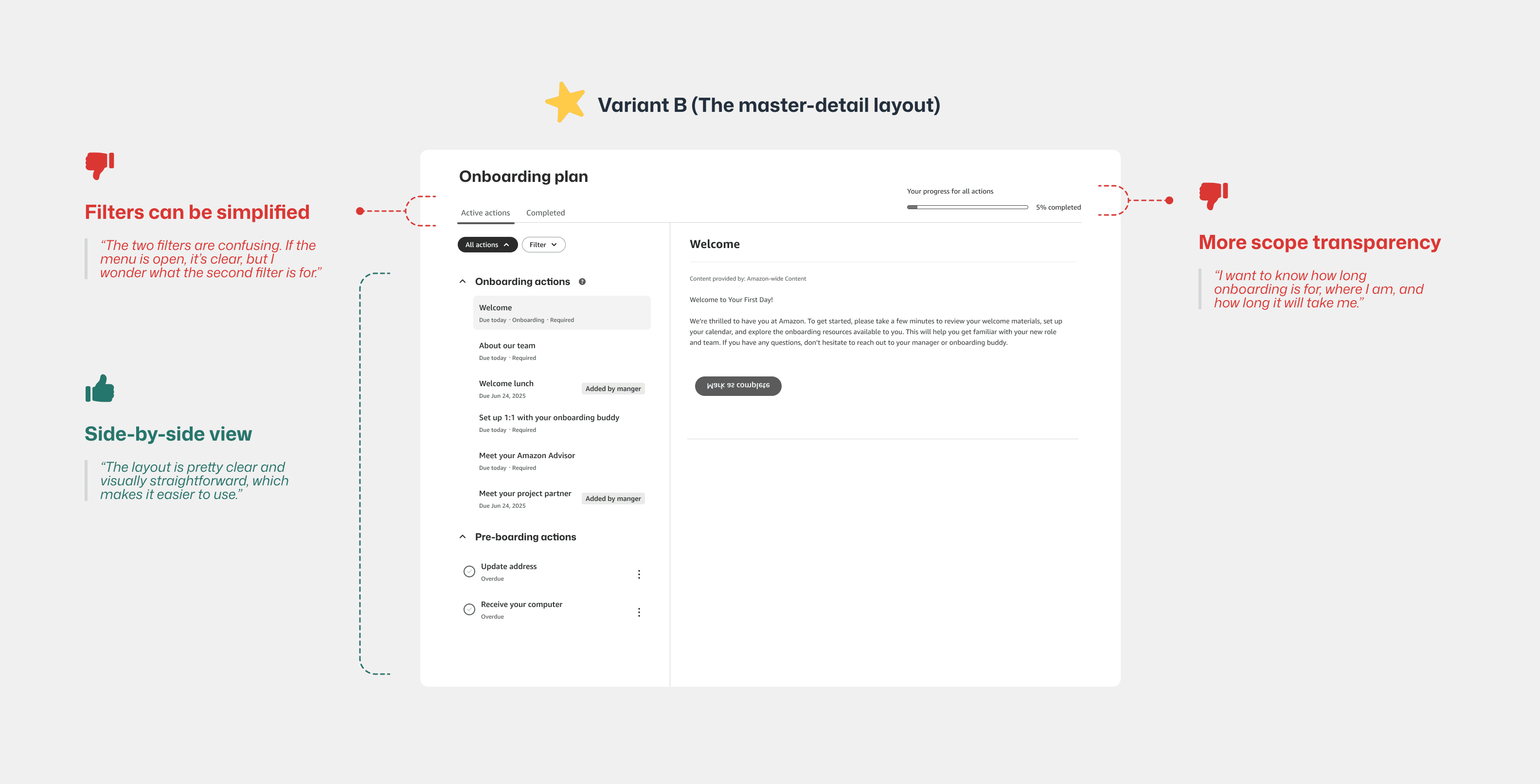
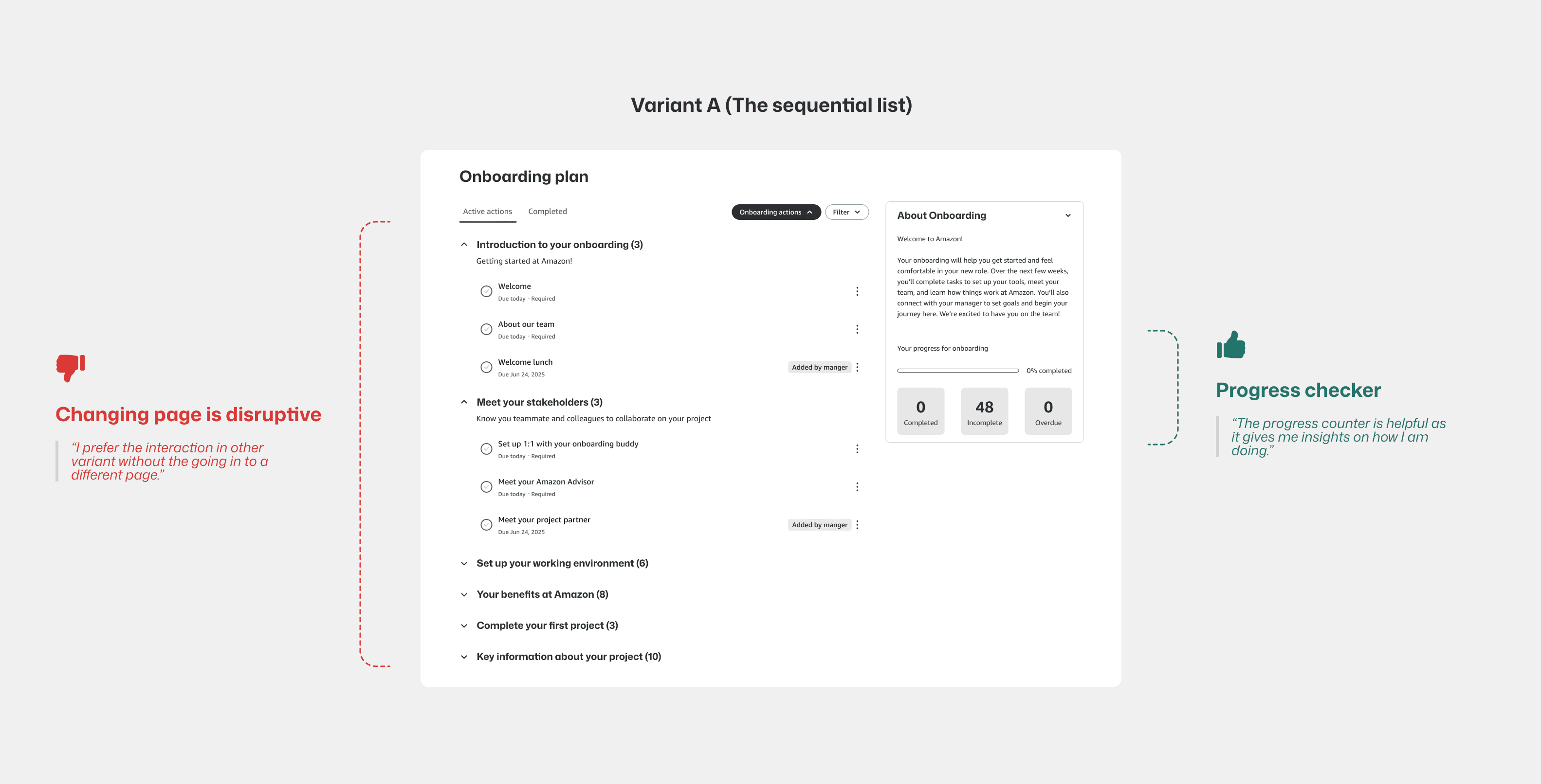
A/B testing insights
I expected Variant A to work better because it looked lighter, but participants clearly preferred Variant B, the master-detail layout.
After the sessions, I used AI to group repeated behaviors, then checked every theme against my raw notes before making a recommendation.
78%
Participants preferred variant B
Opening tasks in separate windows made people lose their place and click back and forth. The Master-Detail layout let them browse and complete goals in one workspace.
89%
Participants liked the modular chapters
Breaking the plan into chapters made the content easier to scan and helped new hires find information that mattered to their role.
Before and after the redesign
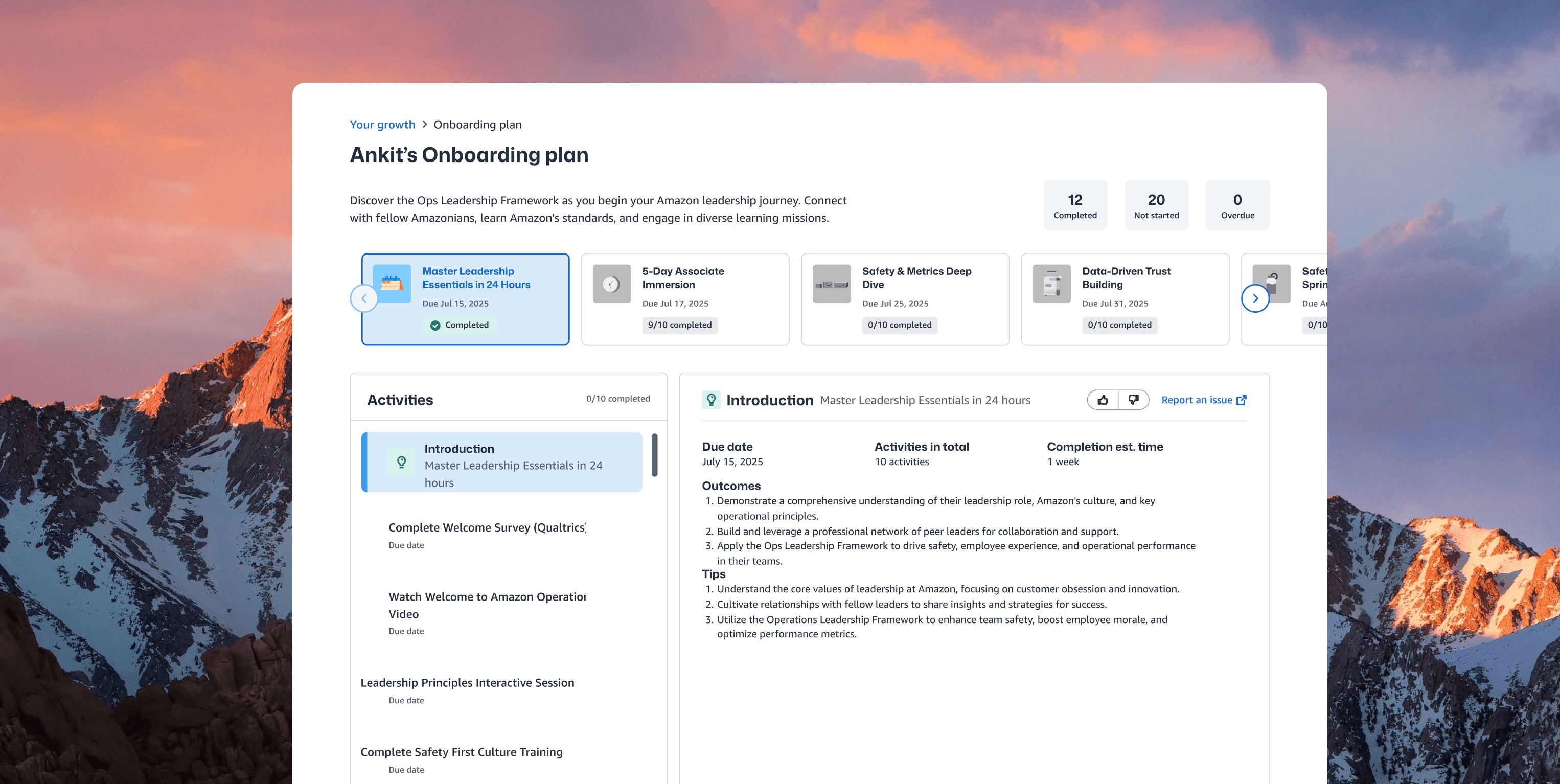
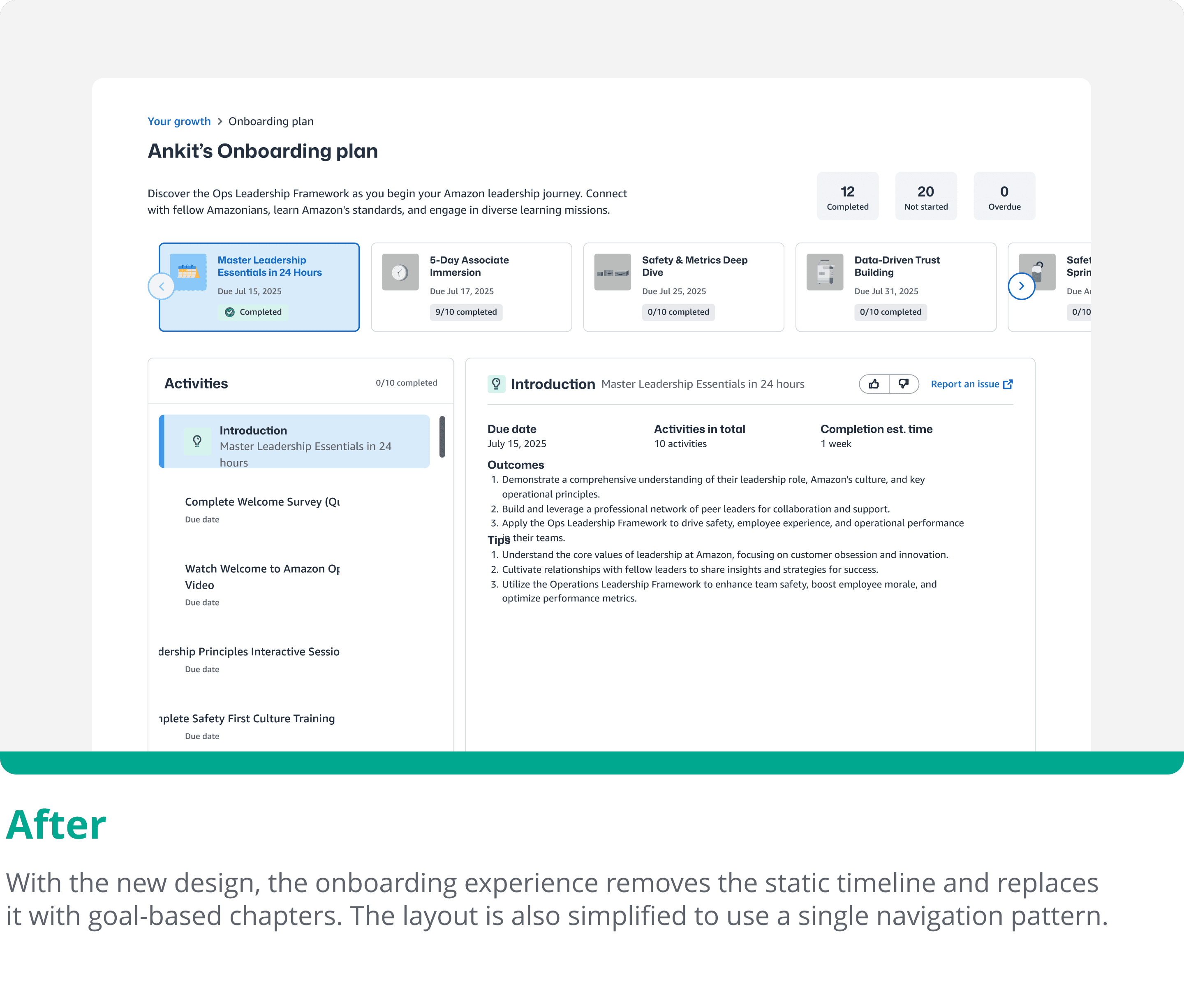
Feedback from the A/B test helped me refine the full experience. The redesign moved from a rigid, text-heavy plan to personalized goals, modular chapters, and one connected workspace.
#1 Master-detail dashboard
I designed a split-screen experience that keeps the full journey on the left and opens the selected task on the right. People can read, complete, and check off tasks without losing their place.
#2 Modular growth chapter
Instead of one overwhelming wall of text, the content is grouped into clear chapters like "Understanding Your Team" and "Operational Deep-Dive."
#3 Personalized learning
The system builds each chapter around the employee's role, level, and region, so they get tasks that are actually relevant to them.
The pilot reached 12K employees
The personalized onboarding plan launched across the full Lift Off population. The results showed stronger completion and satisfaction, while survey feedback suggested that employees felt better prepared to join their teams.
12K employees used the new onboarding plan
The pilot brought the personalized, goal-based experience to the full Lift Off population.
73% → 92% onboarding completion
The completion rate increased by 19 percentage points after the redesigned plan launched.
85% → 90% user satisfaction
Survey satisfaction increased by 5 percentage points with the more personalized experience.
“Having a more personalized onboarding plan made me feel more prepared to join my team.”
Back-end framework design
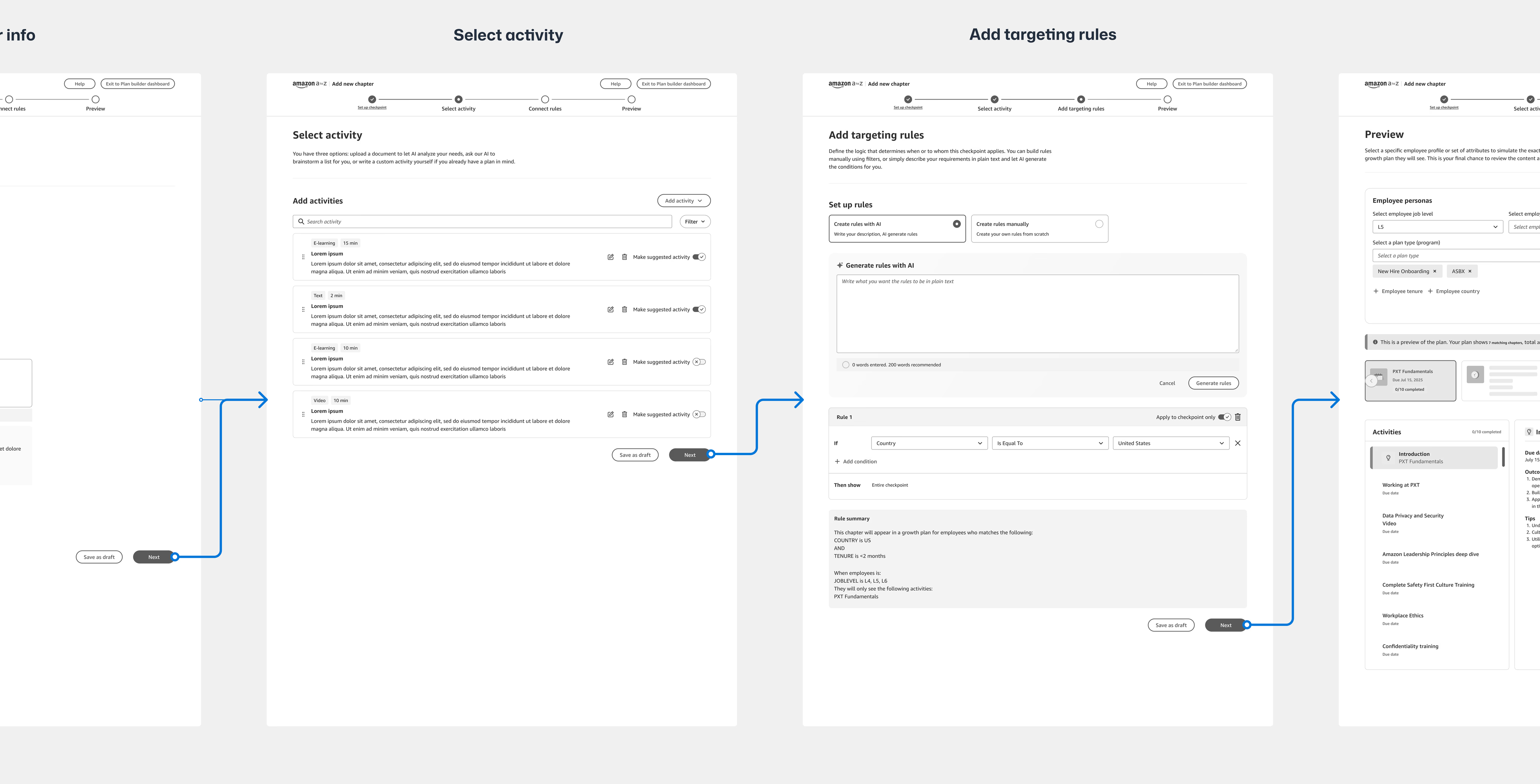
To make the experience work across the company, I also designed a four-step setup flow for managers and program leads. They can group tasks, set due dates, and send custom plans to specific roles or regions without asking engineers to change the code.
Ready to scale globally
This setup tool has not launched yet, but the system work shows how the framework can scale in practice. It gives teams the backend structure they need to bring the same goal-based experience to Amazon's global workforce.